← Index Next: GetAngie →
01 / Project / First aid app

LifeLine

A first aid app for people who have never been trained, designed to stay clear in the minutes when it matters.
Role
Solo: research, flow, identity, UI
Research
Survey of 26, four apps compared
Tools
Adobe Photoshop, InDesign
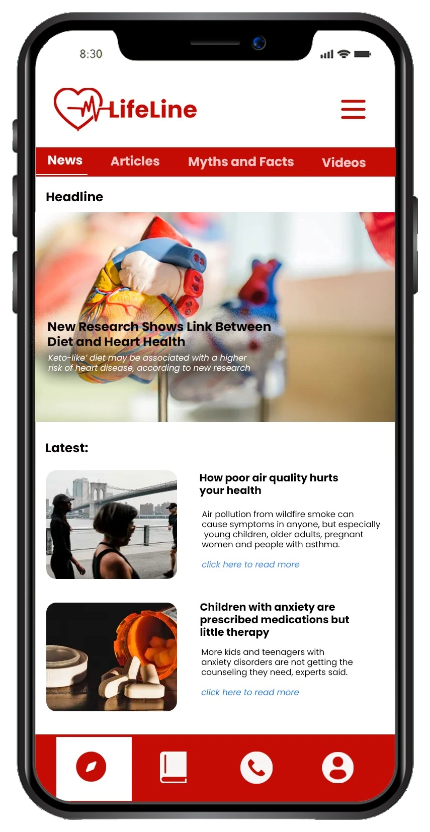
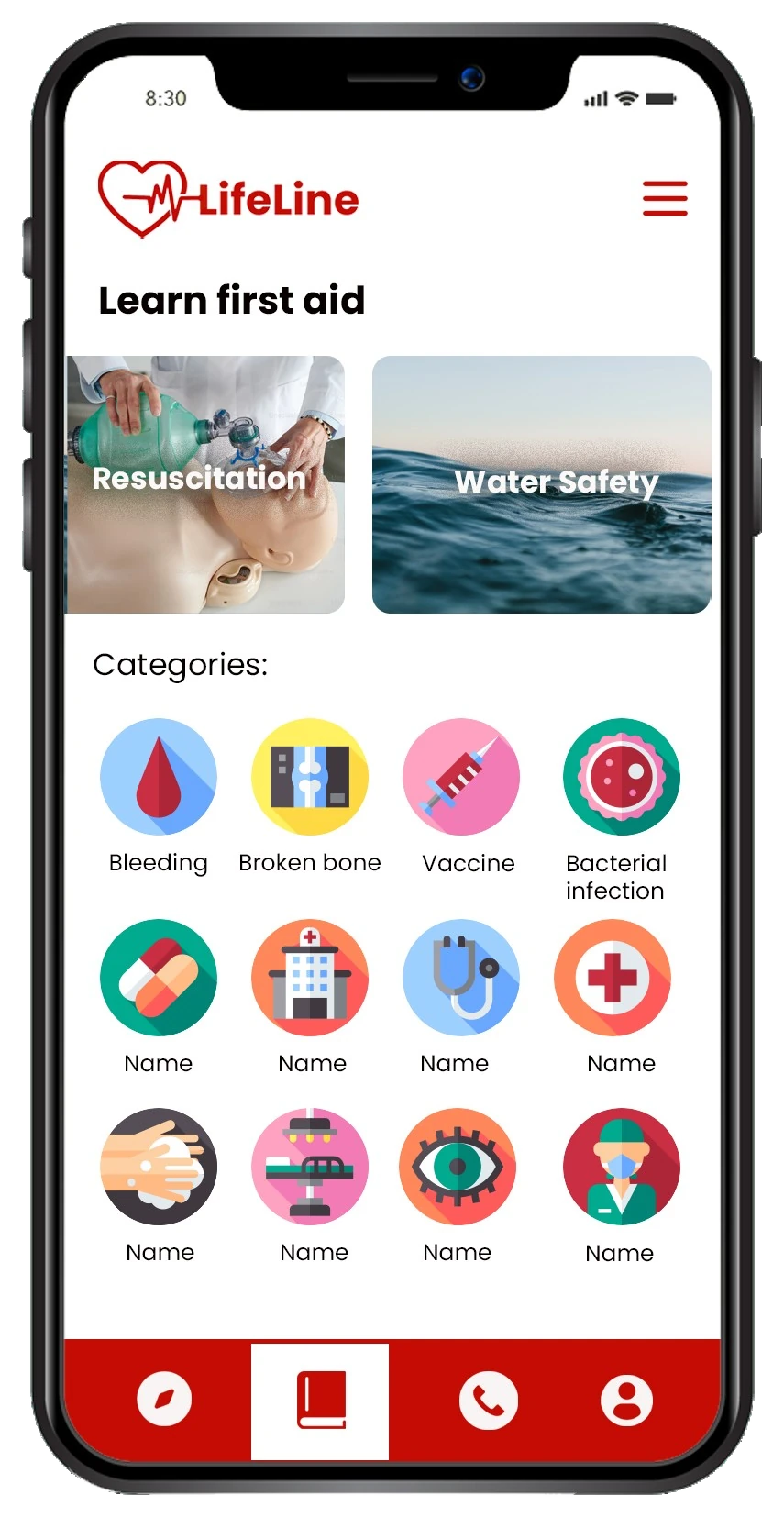
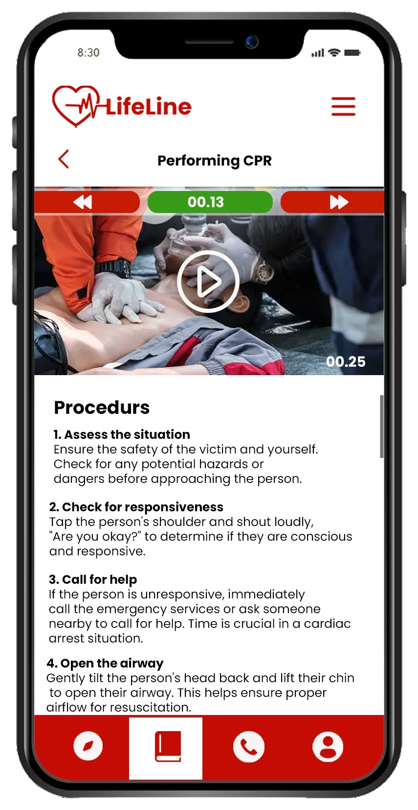
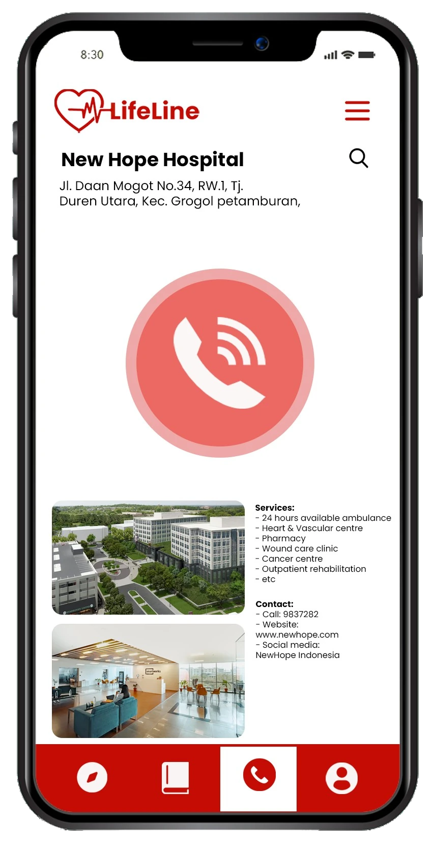
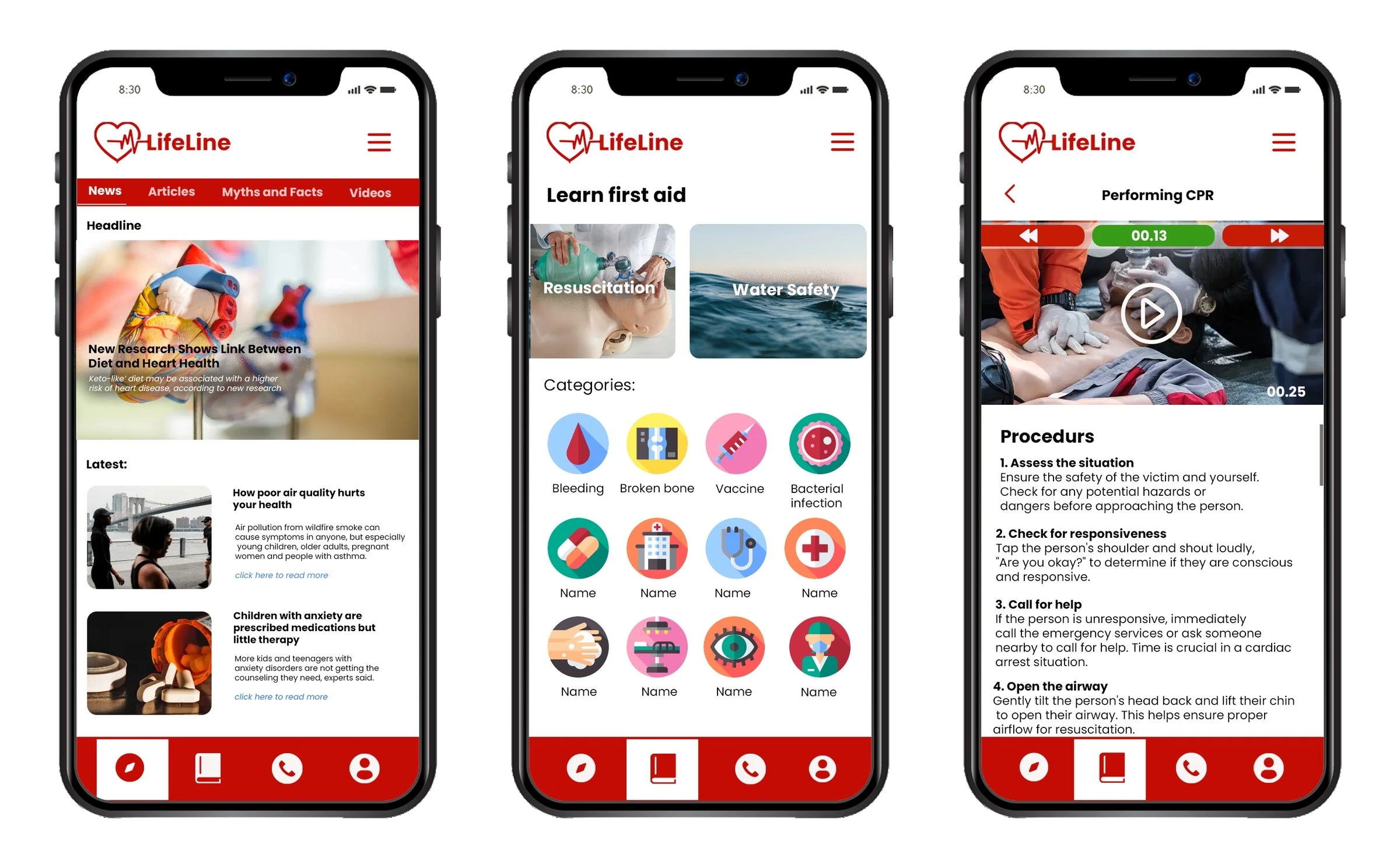
LifeLine screens: Discover feed, Learn first aid categories and a CPR procedure with countdown
01

When I was four, I choked on a piece of beef at lunch. Everyone panicked, and no one knew what to do.

It happened on a field trip with friends and family. I managed to swallow it in the end, but I avoided beef for years afterwards. The first minutes after an accident are critical, and that day nobody at the table could use them.

That experience is why I wanted to make first aid knowledge easier to reach. I believe it should be accessible to everyone, everywhere, because emergencies can happen anywhere and at any time.

02

It was not only my family. Most people have never been trained.

5%of adults in the UK feel confident providing first aid.British Red Cross, 2018
7%of people in Singapore are trained in basic first aid.Singapore Civil Defence, 2019
18%of people in the United States are up to date with CPR training.Harvard Medical School, 2022
03

How might a phone give an untrained person guidance clear enough to act on in the first minutes of an emergency?

04

I asked 26 people what they can already do and what they would need.

A Google Forms survey on first aid education in my community. 46.2% of respondents were aged 35 to 40, a group known for being proactive about their well-being and carrying higher responsibilities.

Share of respondents
Have no formal first aid training96.2%
Rate basic first aid knowledge 5 of 5 in importance92.3%
Can do wound care76.9%
Can help someone who is choking26.9%
Can perform CPR19.2%
Want quick search and call for emergency help84.6%
Want video tutorials61.5%
Want text tutorials53.8%

People agree first aid matters but know little beyond basic wound care. Only one respondent had formal training. What stops them is split almost evenly: information is hard to find, instructions are unclear, and resources are limited (23.1% each), then unreliable information (19.2%) and no internet when needed (11.5%).

05

Then I studied four health apps and their reviews for what to borrow.
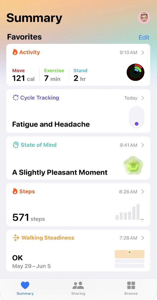
Apple Health summary screen

Apple Health

Borrowed
Health data kept in one place, and health updates that keep users informed.
Fixed
It only works well on iPhone. Device compatibility went on my list.
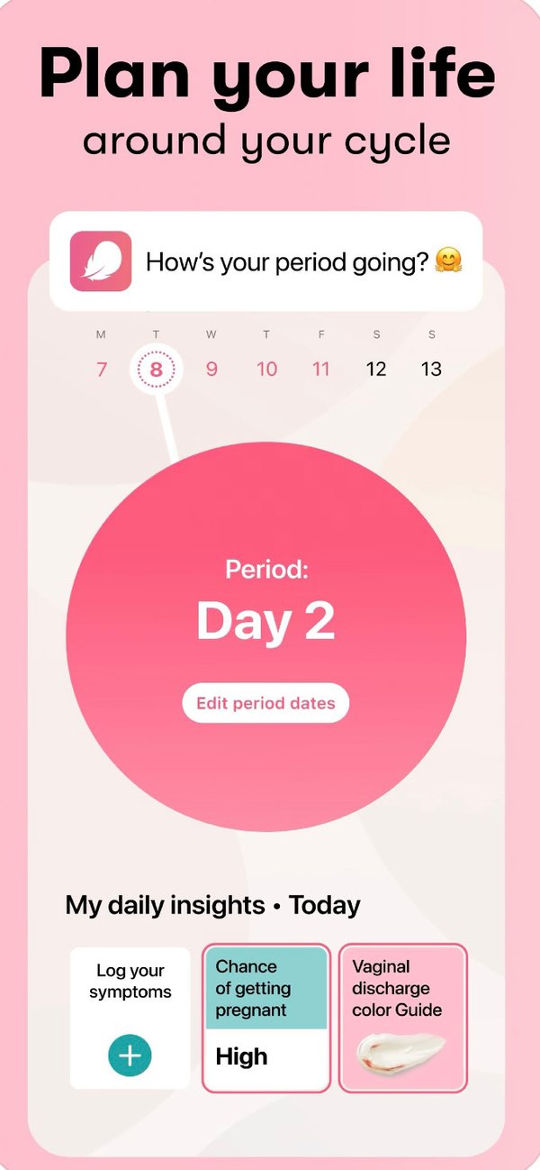
Flo cycle tracking screen

Flo

Borrowed
Easy data input and informative articles.
Fixed
The amount of information can overwhelm, so mine had to be more concise.
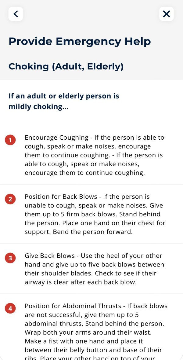
First Aid IFRC choking instructions screen

First Aid, IFRC

Borrowed
Clear emergency guides, and linking first aid to nearby facilities.
Fixed
A reviewer could not tell titles from instructions because the text all looked the same. Type sizes need to differ.
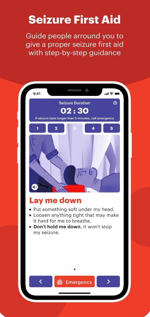
Aura Seizure First Aid screen with timer

Aura: Seizure First Aid

Borrowed
A countdown timer, an alert button and a list of emergency contacts.
Fixed
It covers seizures only. LifeLine had to cover many kinds of emergency.
06

Each finding became a feature.

84.6% want quick search and callA Call tab to reach nearby hospitals, police and fire stations with one button
Instructions feel unclear, and people want videoEvery procedure pairs a short video, illustrations and numbered steps
Information is hard to findTen fixed categories in Insights, from CPR to poisoning
Aura's timer and alert buttonA "golden time" countdown on procedures, and a large call button
Aura's contacts, Apple Health's dataA Profile holding blood type, allergies, conditions and emergency contacts
Flo's articles, kept conciseDiscover, a daily feed of health news, myths and facts, and first aid tips
07

Four tabs, each one tap from launch.

The app opens on its logo, then a home with Discover, Insights, Call and Profile arranged left to right. One safeguard sits in the flow: if an emergency contact has not responded after three notifications, the app directs the user to a call button for nearby emergency services.
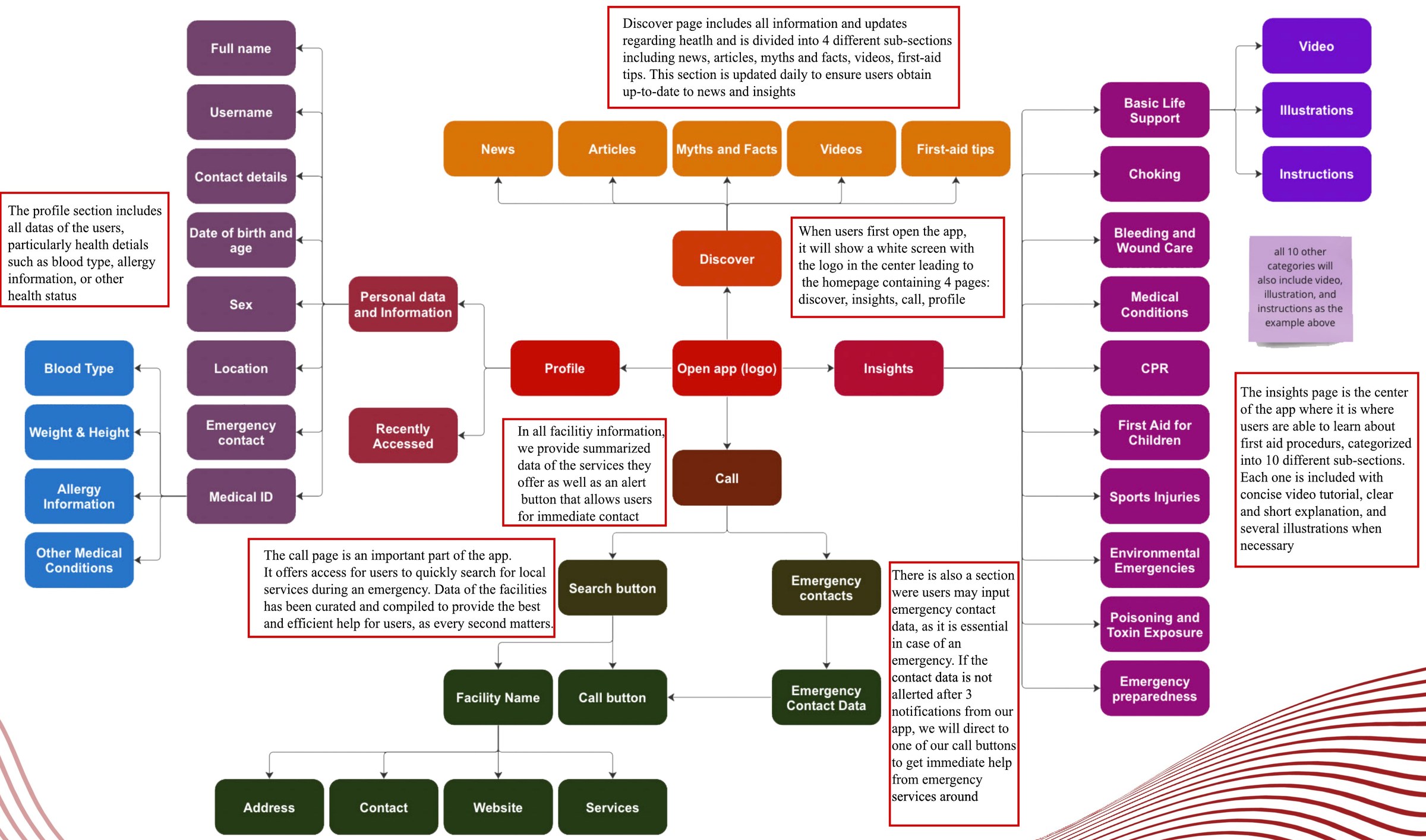
LifeLine user flow diagram covering Discover, Insights, Call and Profile
08

Red, because it reads as urgent everywhere.

Chosen: red
Considered: ISO safety green
ColourRed grabs attention and signals urgency. It is internationally associated with safety, even though the newer ISO standard is green. White is the background so text stays readable.
NameA lifeline of vital information in a critical moment.
MarkA heart, for life and care, joined to a pulse line, for action and urgency.
TypePoppins Bold for headings and Poppins Regular for body, with clearly different sizes.
LayoutFormal and uncluttered, so it reads as a credible source and can be scanned under stress.
LifeLine logo: a heart with a pulse line
09

Three things changed between the draft and the final.

A countdown was added

The "golden time" countdown now sits above each procedure, because the decisions on that screen are time-sensitive. Left: before. Right: after.
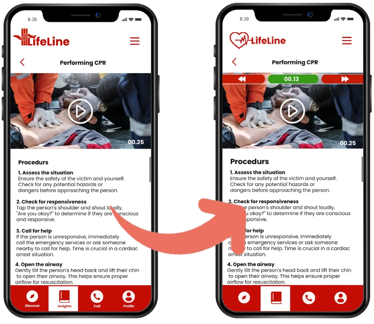

CPR screen before and after adding the countdown
Tab bar before and after removing labels

Tab labels were removed

The names under the four icons came off to keep the bar simple and clear.

The logo was redrawn

The first mark was a red cross formed by two hands, with three lines for check, call and care. It became a heart with a pulse line so the symbol reads as the name.

Earlier LifeLine logo draft with two hands forming a cross
10

The final app, screen by screen.

DiscoverMedical news, expert articles, myths and facts, videos and first aid tips.
InsightsThe highlight of the app. Step-by-step first aid in ten categories, each with video and illustrations.
CallDirect contact with nearby hospitals, police and fire stations, a summary of each facility's services, and a list of emergency numbers.
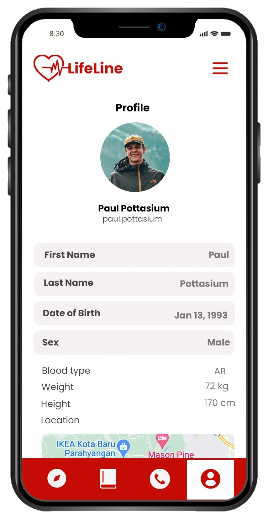
ProfileName, location, contacts and medical details such as blood type and allergies, plus saved instructions for quick reference.
Discover screen Learn first aid screen Performing CPR screen with countdown Call screen for New Hope Hospital Profile screen with medical details
The video steps through the five final screens. It is not a recording of a clickable prototype.
Check✺Call✺Care✺Discover✺Insights✺Profile✺ Check✺Call✺Care✺Discover✺Insights✺Profile✺