Aruna
How a beach town nobody searches for became a trip you can research, book and plan on one website.
Indonesia has 17,001 islands. Bali gets nearly all the attention.
Lombok sits just east of Bali, with its own culture, landmarks and landscapes, and it is still overshadowed by its neighbour. A large part of the gap is online presence: there is little to find, so there is little reason to go.
As a local Indonesian I hear about places like Lombok through word of mouth. A tourist relying on an internet search never gets that conversation. That was the starting point: give an overlooked beach town the online presence it is missing, as the centrepiece of a wider rebrand.
How might a town that is hard to find online become a trip someone can research, book and plan in one sitting?
I interviewed travellers before I drew anything.
They came from different backgrounds and had different travel experience. I chose interviews over a survey because I wanted detail on behaviour and pain points, not only counts.
The studies agree: price leads, photos decide, and people scan.
I compared four travel sites. None let a visitor learn about a place, trust the reviews and book it without leaving.
I went through each platform and its Google Play reviews, and sorted what I found into what to borrow and what to fix.
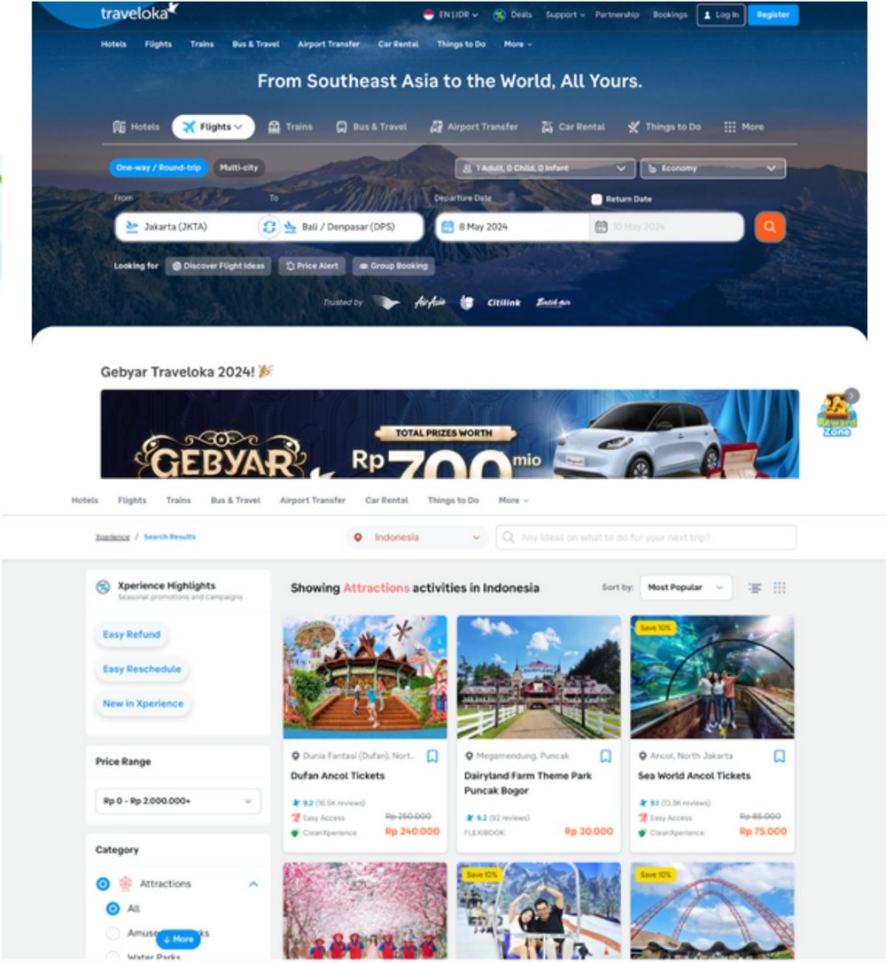
Traveloka
Categories that put discounts and rewards up front, nearby attractions, destination articles, a top bar for navigation.
Information overload and sections opening in new tabs. Reviews ask for human support when the chatbot cannot answer.
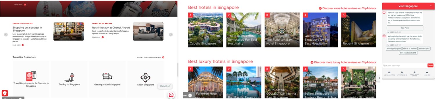
Visit Singapore
Minimal design, clear type, traveller essentials such as documents and transport, a chatbot for real-time help.
No direct booking, no visitor reviews, and information that does not adjust to current location and time.
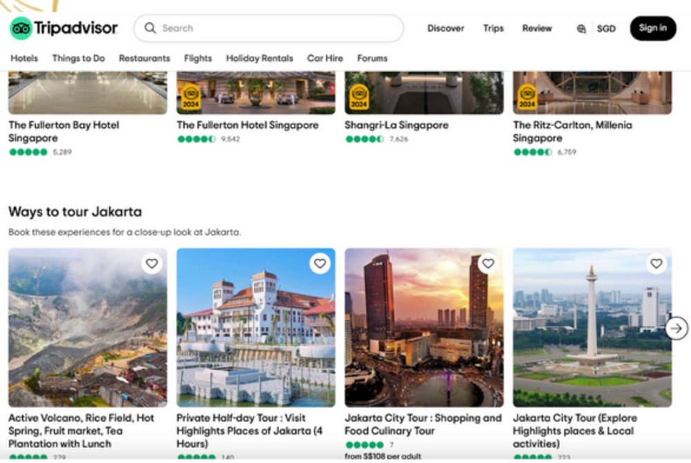
Tripadvisor
Credible reviews, a personalised itinerary and an interactive map.
Bookings redirect to third parties, the volume of content overwhelms, and culture and history get little space.
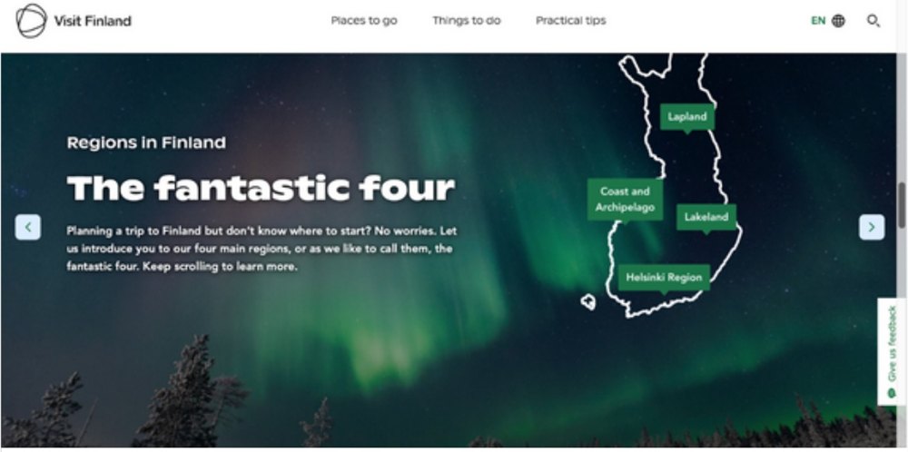
Visit Finland
Fun facts through the interface, local weather and time, filtering activities by preference.
No bookings, no user reviews, and trouble saving favourite locations.
So Aruna puts every part of a trip on one platform.
Planning, booking, preparing and the travel itself.
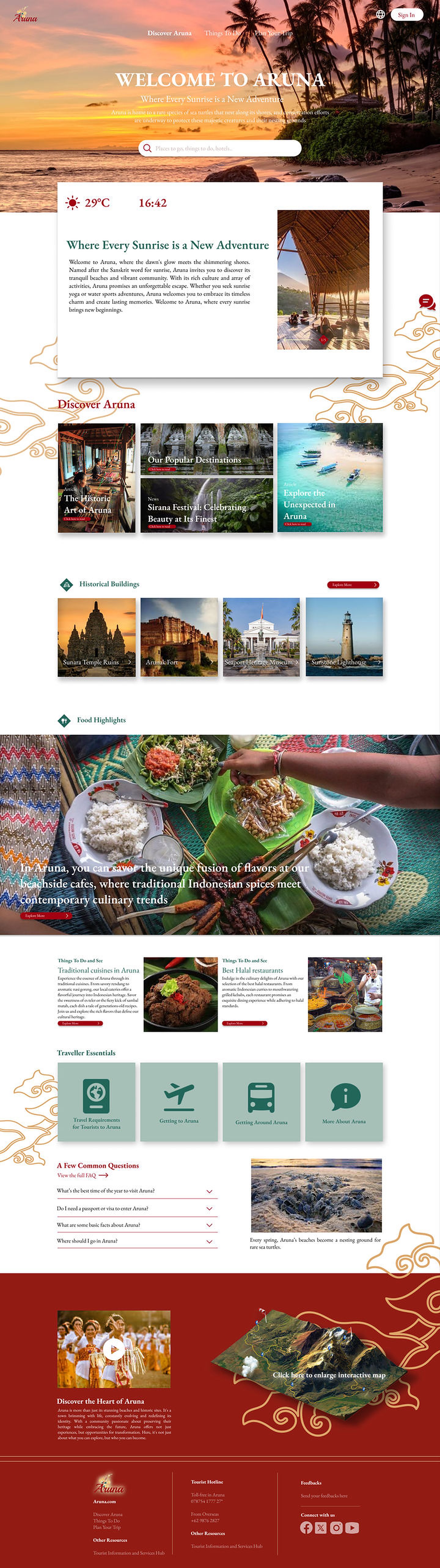
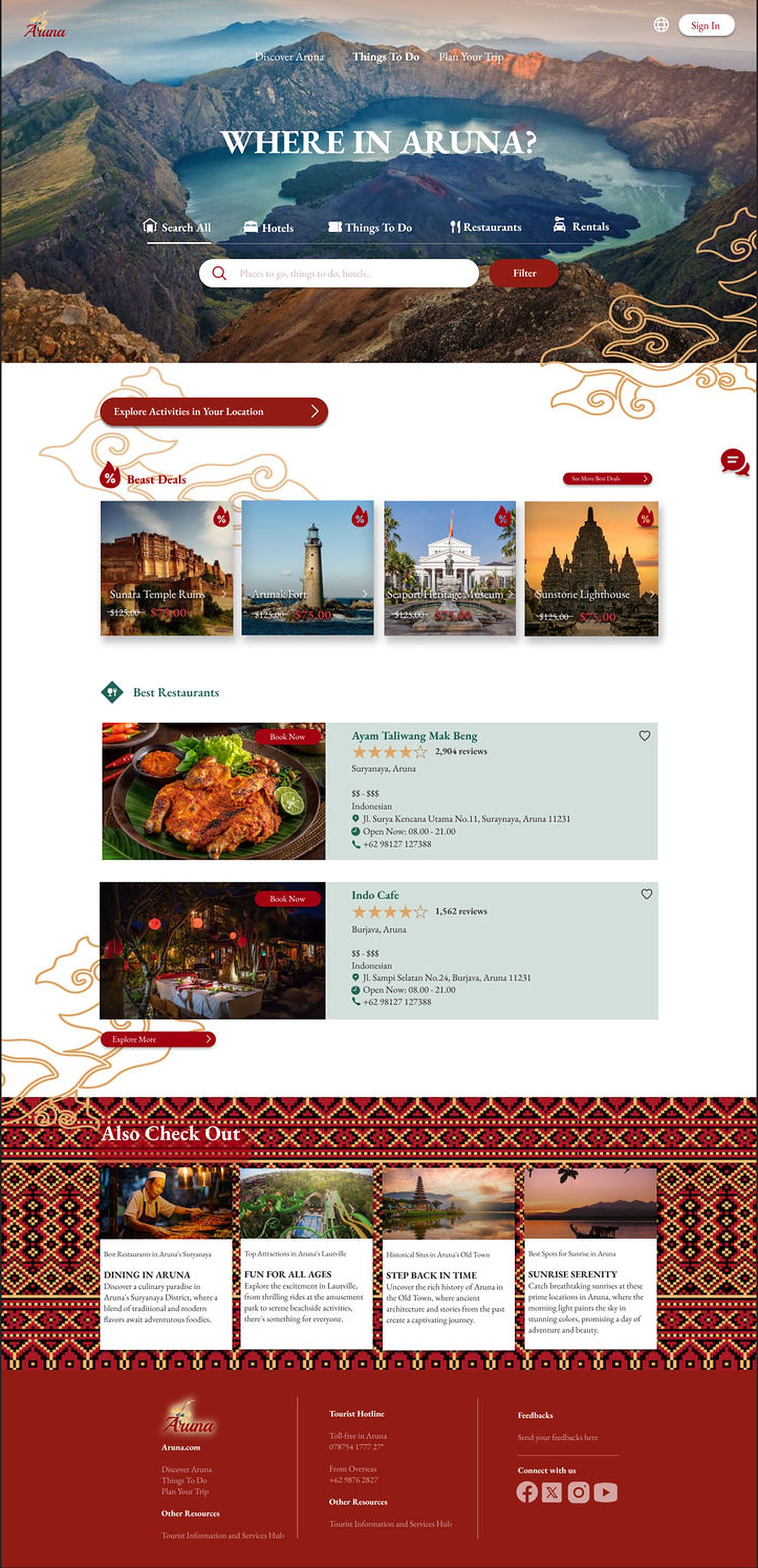
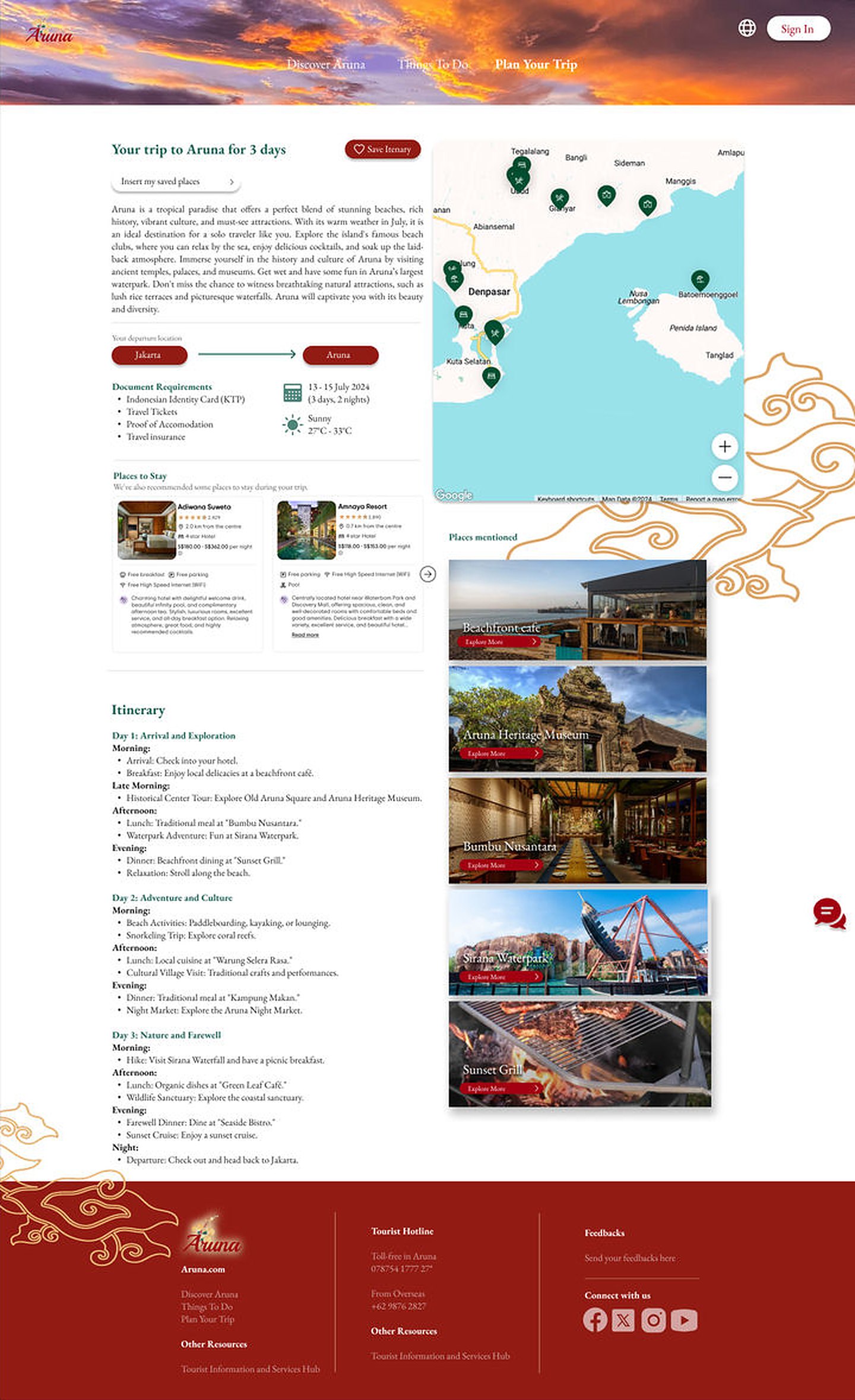
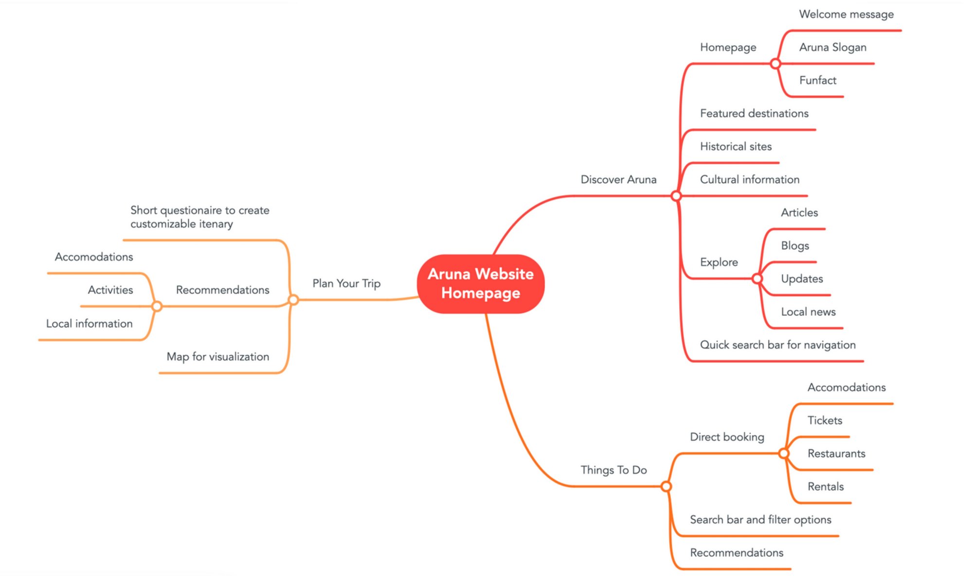
Three pages follow the three stages of a trip: get curious, book, commit.
Interviewees complained about complex navigation, so I sorted every feature into a flow before drawing a screen.
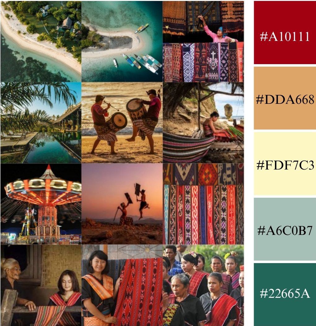
The name means the glow of sunrise. The colours come from Lombok batik.
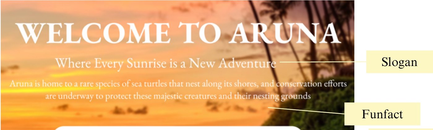
"Aruna" comes from Sanskrit: the reddish glow of the rising sun. It stands for new beginnings, and it gave the slogan, Where Every Sunrise is a New Adventure.
Batik Sasak maroon
Sand
Jungle and ocean

Iterating the logo
I tried the name in several script typefaces. All were elegant, but Playball kept the best balance of elegance and readability, so the mark stays recognisable. Floral elements add natural beauty and a sense of renewal.
Each screen answers something a person said, a study found or a competitor got wrong.
One view to orient
People scan, so the first screen holds three things: the slogan, one random fun fact about the town (an idea from Visit Finland) and a search bar for quick access.
Weather and time, borrowed
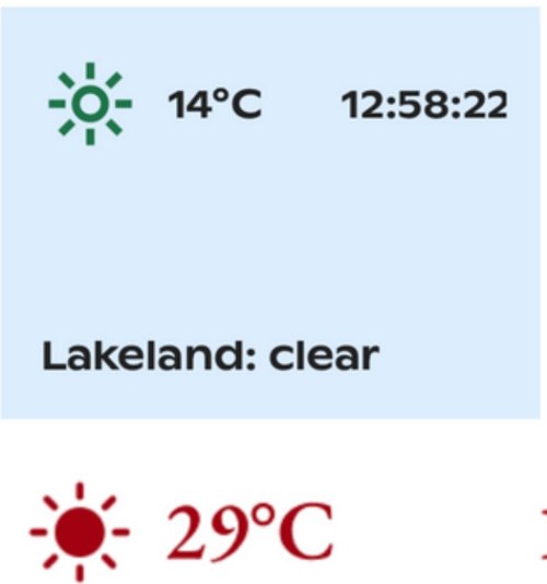
Visit Finland shows local weather and time. Aruna does the same on its homepage, top: their widget, bottom: mine, so visitors know the conditions before they plan.
Deals first, booking in place
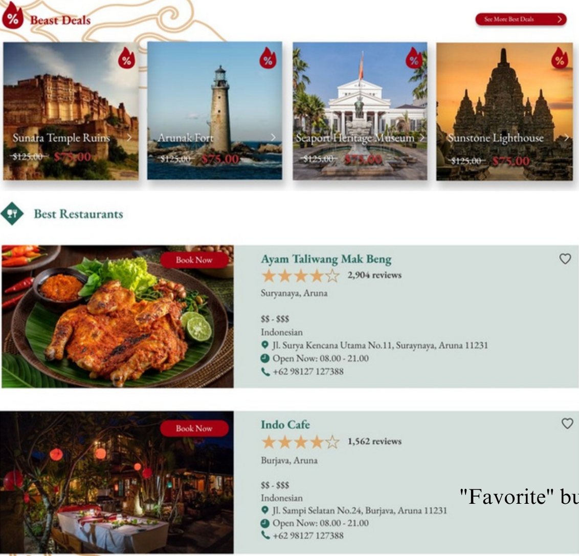
Discounts are the first thing people notice on a travel site, so Best Deals leads the page, with large photos because photos drive decisions. Cards carry reviews for credibility, a Book Now button and a favourite, which closes the gap the tourism-board sites left open.
Near me, filtered
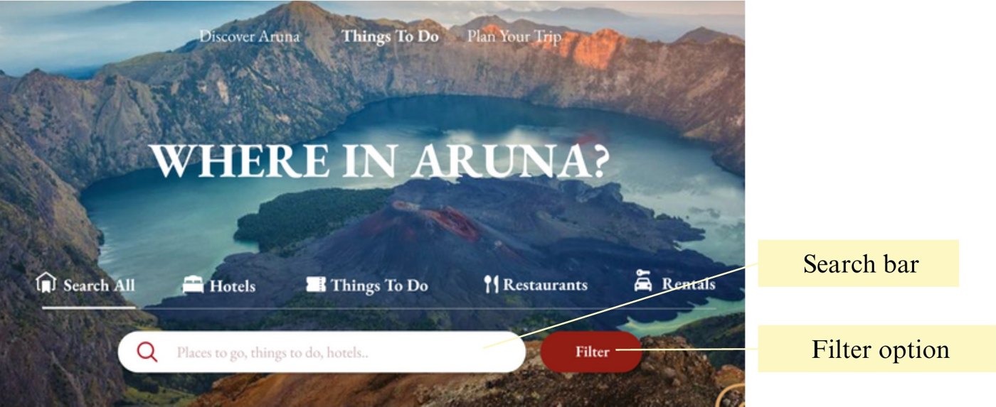
Interviewees wanted places based on where they are. The page opens on the most searched categories, a search bar and a filter, plus "Explore activities in your location" for nearby places and essentials such as supermarkets, laundry and gas stations.
A plan in a few questions
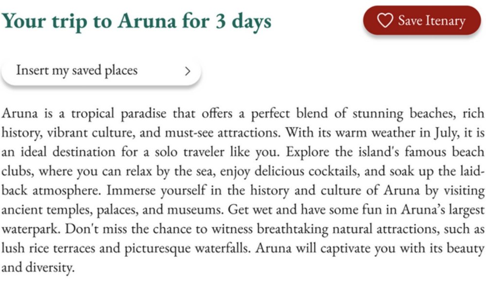
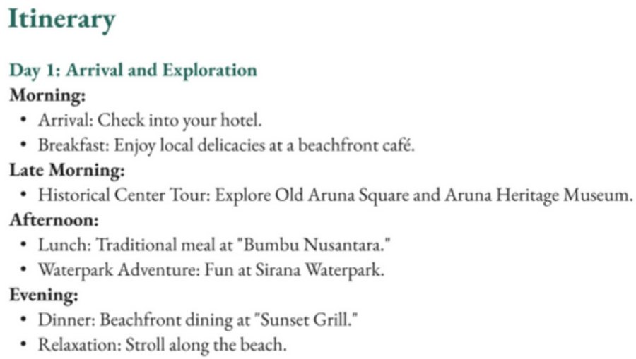
Inspired by Tripadvisor's itinerary feature. Visitors answer a short questionnaire on dates, budget, group size, activities and accommodation, and get a day-by-day itinerary with required documents, weather and places to stay. Saved favourites can be added in.
A map, and a human
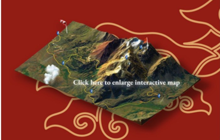
A 3D interactive map lets visitors click any location for details, photos and reviews. An AI chatbot answers questions in real time, and because reviews of other apps asked for human support, every footer carries a hotline and a feedback link.
Three pages, one visit.
Hover each screen to scroll it, or open the prototype to click through.