← Index Next: Aruna →
03 / Project / Website redesign

Shoreline Historical Museum

A community museum's website, redesigned around what 35 visitors, volunteers and staff said about the old one.
Role
UX Design & Web Intern, UX Café Club, Shoreline Community College
When
Survey July 2025, proposal December 2025
Tools
Figma, WordPress, WAVE
Before
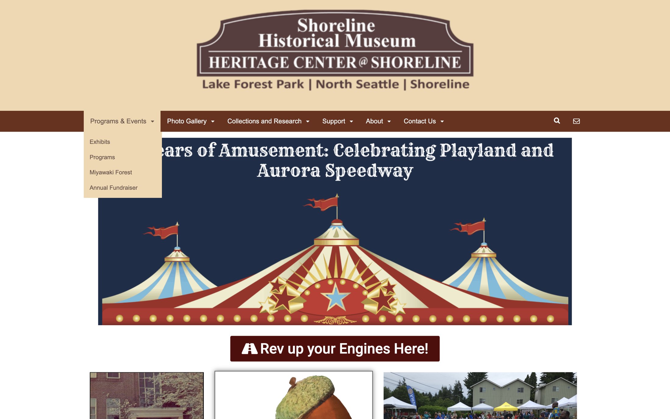
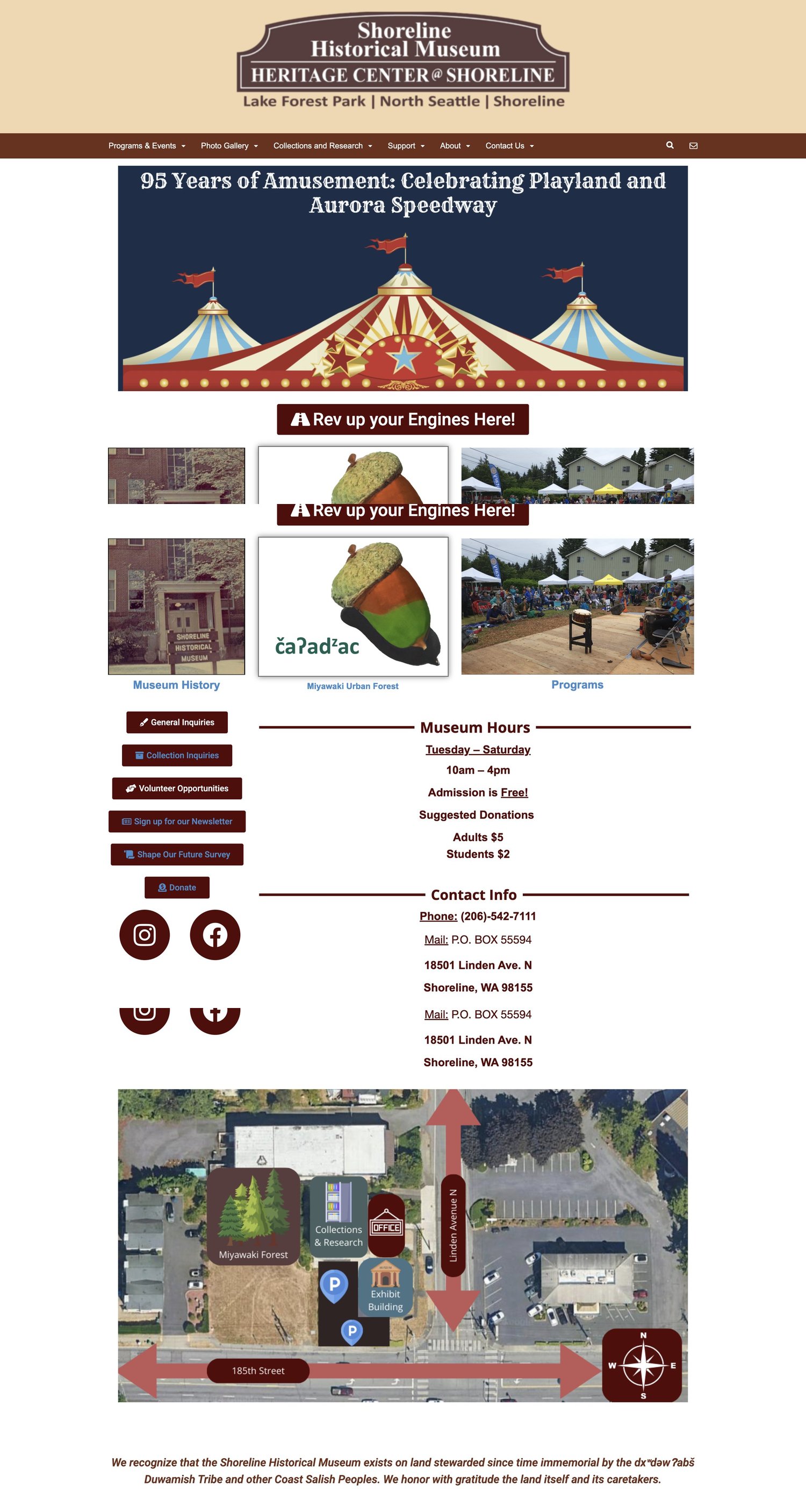
Three views of the old Shoreline Historical Museum homepage
After
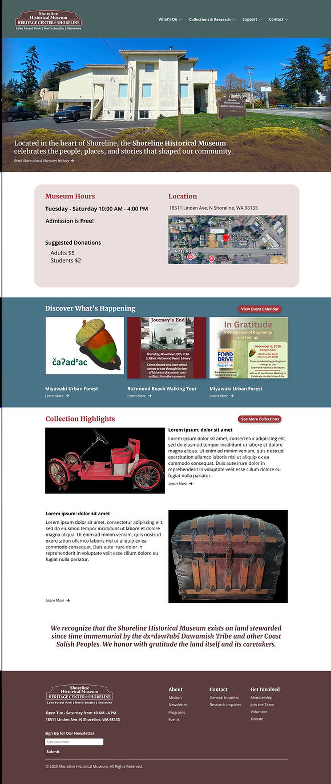
Redesigned Shoreline Historical Museum homepage
Hover either side to scroll the page
Open the Figma prototype ↗
01

The old site held everything people needed. It was just hard to find.

I started by going through the existing site screen by screen. A tall header filled the first view, the hours and contact details sat far down the page beside a stack of buttons, and blue link text ran on tan and brown backgrounds.
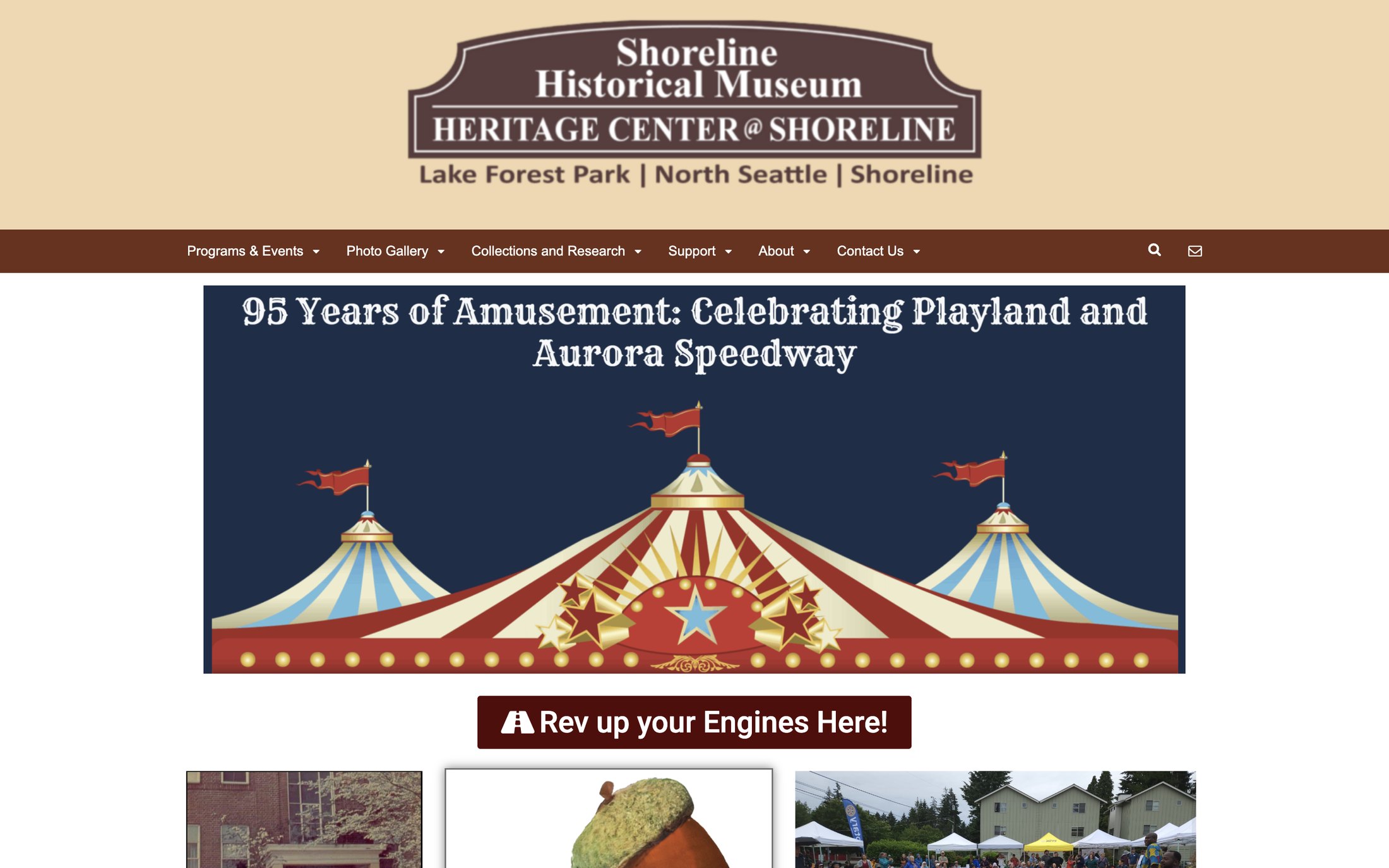
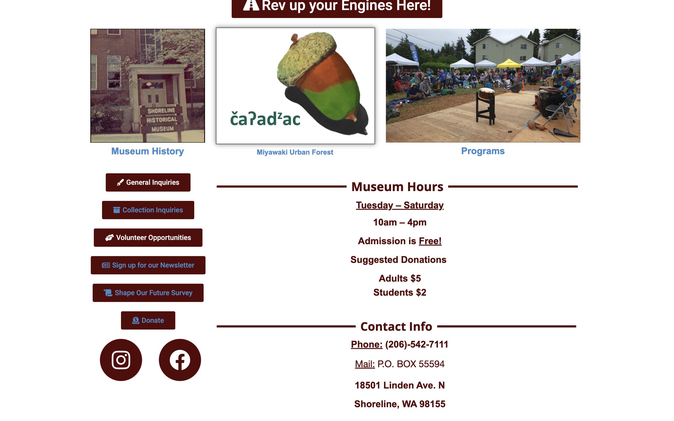
Old homepage: large logo header above an event banner
First view: mostly header
Old homepage: buttons, hours and contact info
Hours and contact, well below
Old navigation with a dropdown open
Six menus with small dropdowns
02

An accessibility scan flagged 10 errors and 9 contrast errors on the homepage.

I ran the page through WAVE, a web accessibility evaluation tool, to see what a screen reader or a low-vision visitor would run into. It also raised 10 alerts.
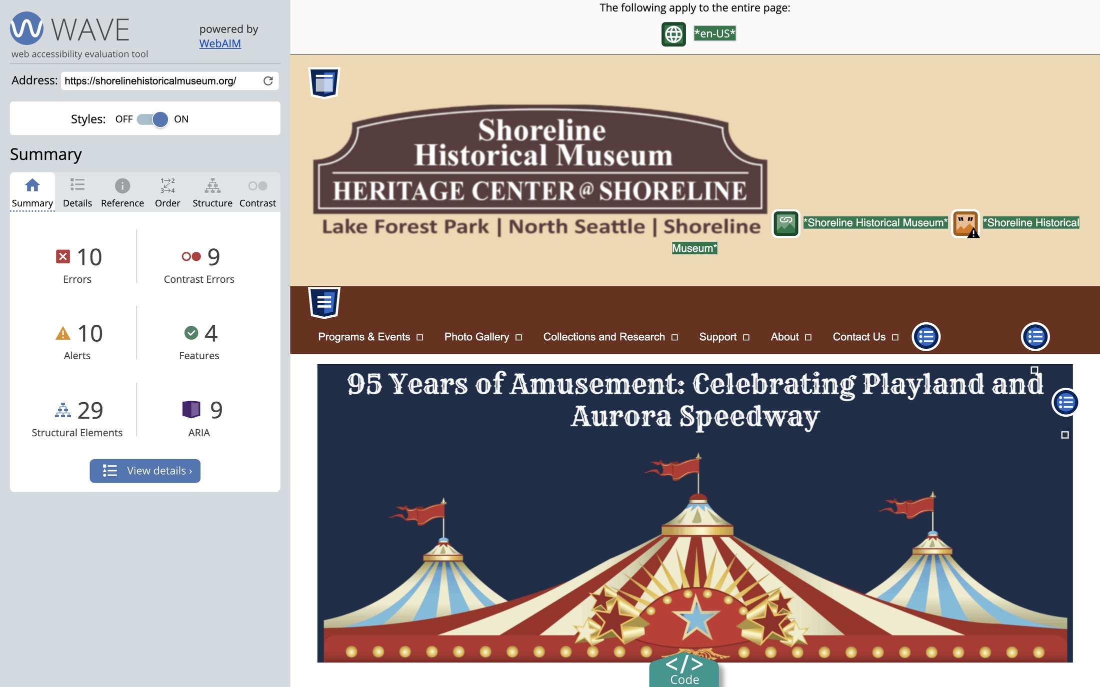
10errors
9contrast errors
10alerts
WAVE accessibility report for the old homepage
03

Then I asked the people who use it. 35 answered.

A Google Form went out in July 2025, shared with a QR code. Visitors, Shoreline residents, volunteers, museum staff, educators, a donor and a member replied.

How easy is the current website to use? 1 to 5
5, very easy5
414
310
25
1, very hard1
Average 3.5 of 5
What should the homepage prioritise? Respondents of 35
Opening hours and location33
Upcoming events33
Collections13
Donation info9
Museum history5

The site was not broken: most people rated it 3 or 4. The opportunity was in the middle, turning "adequate" into easy.

04

In their words: dated, clunky, hard to read.

"The design is old fashioned. It is clunky"Volunteer
"Blue type on brown buttons is hard to see"Visitor, Shoreline resident
"Separate different topics better, avoid brown font"Visitor
"Cleaner graphical interface, more white space"Volunteer
"Just needs a refresh, aesthetically."Visitor
"The browntone color scheme - looks 'historic'!"Shoreline resident, volunteer

People also named what to keep: "Has all the info I'm looking for", "It's minimal", "Fast and responsive". The content was right. The presentation was the problem, and the brown tones divided opinion.

05

So the feedback set the goals.

AccessibleImprove accessibility and readability, informed by WCAG 2.1.
FindableMake hours, location and events easier to find and to read against their background.
CleanerA more modern, less "clunky" layout.
EngagingGive visitors and community members more reasons to explore.
MaintainableKeep the site easy for museum staff to update.
06

Each change traces back to something someone said.

33 of 35 want hours and location firstOne card under the hero with hours, admission, address and an embedded Google Map
33 of 35 want upcoming eventsEvent highlights on the homepage, each leading to its own page, with a View Events call to action
13 want collectionsCollection highlights below the events
"Hard to know where to look", "clarity of menus"A simpler menu: Home, What's On, Collections & Research, Support, Contact
Blue on brown is hard to read, 9 contrast errorsAccessible contrast within the museum's palette, a clear heading structure and alt text on images
Font vote: Open Sans 15, Merriweather 15, EB Garamond 5Both winners: Merriweather for headings, Open Sans for body
Brown feels "historic" to some, dated to othersAsked the museum whether to keep the light brown or move to the new palette
07

Two typefaces and the museum's own palette.

Headings
Merriweather
Body
Open Sans
Palette provided by the museum
5A3D3D
497487
9C3A3A
BF5858
496161
08

Homepage first, then page by page.

I wrote the plan up as a proposal for the museum on 14 December 2025, with the open questions listed for their approval: the homepage wording, the colour direction and the phased approach.

1. ResearchUser survey, review of the current site's issues, first content and structure plan. Done.
2. DesignHomepage and key page layouts in Figma, visual direction and typography. Done.
3. ReviewShare designs with the museum team, gather feedback, revise.
4. BuildApply the approved design in WordPress with accessibility checks and content updates. Planned for 16 December to 31 January.
5. LaunchFinal review and launch of the updated pages. Planned for 1 February.
1.4Kpage views in November 2025, before the build began
644visitors that month
What's On✺Collections & Research✺Support✺Contact✺ What's On✺Collections & Research✺Support✺Contact✺